AuditComply have a new and improved look! Here are a few of the improvements we have made to the way you navigate the system.
The navigation bar is now at the left hand side. This allows you to see all the different sections of the portal far more easily, with all pages abel to be exposed or not with hiding the section headers.
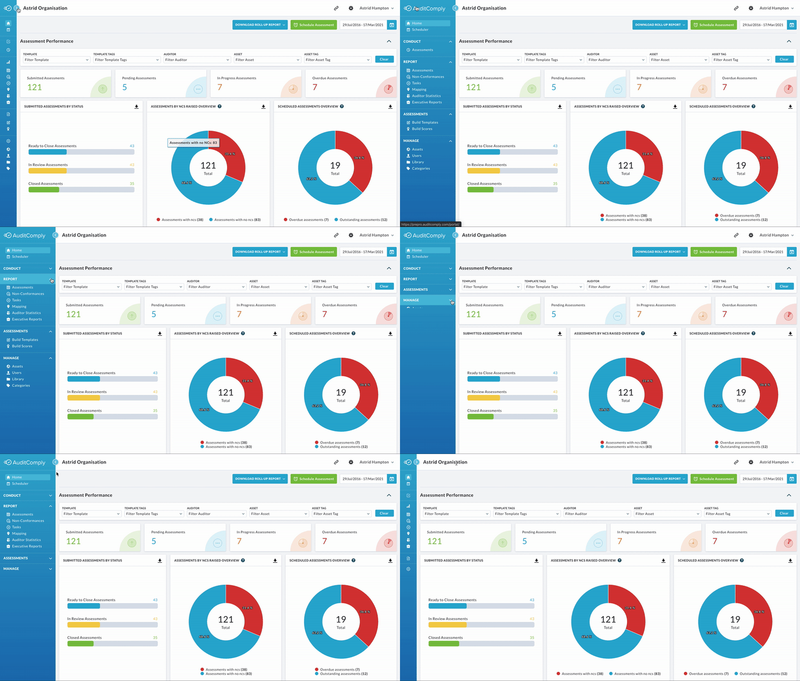
You can hide the side navigation bar by selecting the icon seen highlighted above beside the sidebar. This allows for more working space.
Our Dashboard is now called “Home”. This shows the analytics on a number of different sections of the Organisation.
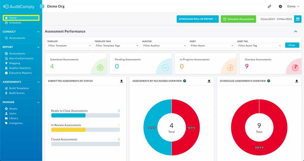
We have also changed ‘Audits’ to ‘Assessments’ as we believe this will better represent the section as a whole. This hasn’t changed anything else except for the title of the section.
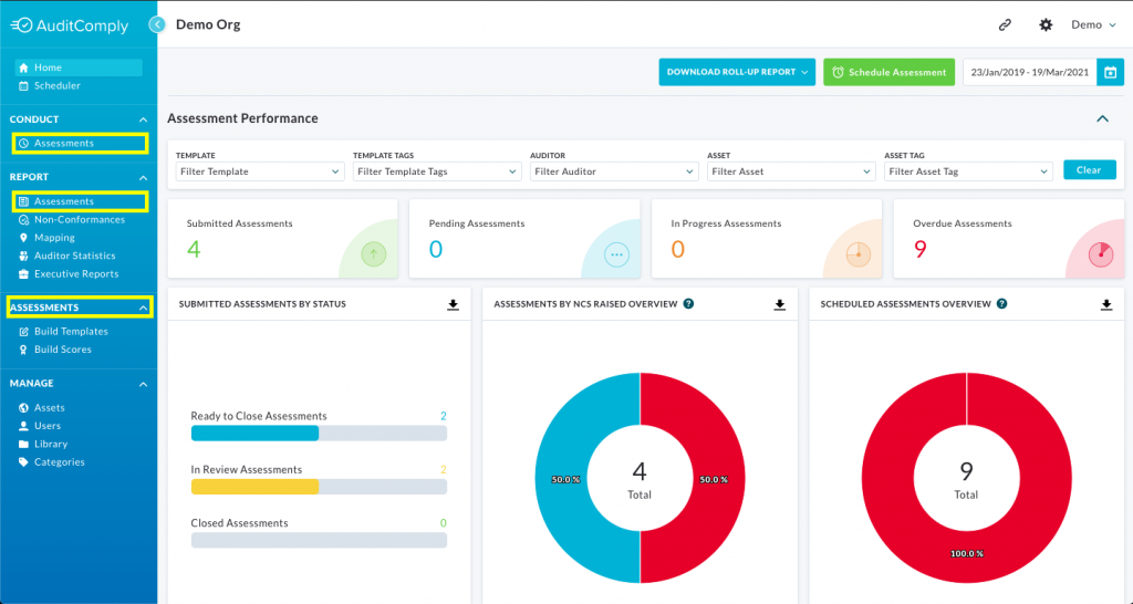
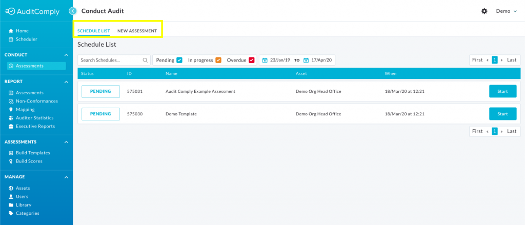
Our tabs have now moved to above the current list. You will notice this in a number of places, for example the Conduct Lists (seen below), Template Builder and the Reporting lists
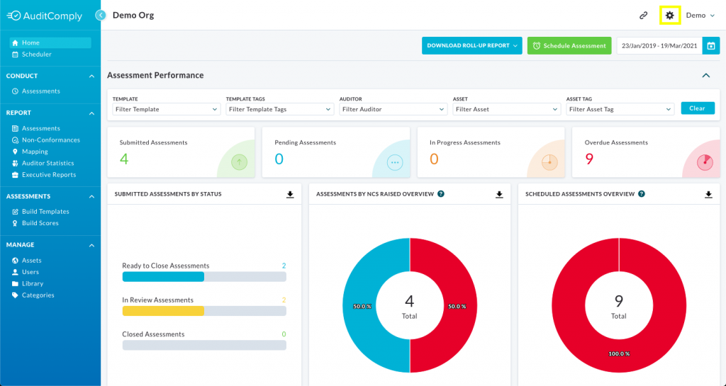
There is a new settings button, this button will only be available if you are an admin of the organisation and will take you to the Organisations settings page.
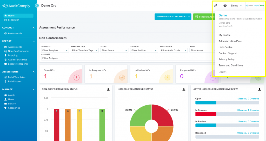
The Organisation Logo has moved to the right hand side of the page beside the current profile name.
We at AuditComply would love your feedback on our new design and layout. As you may notice this is the 2nd iteration of this menu and the changes come from feedback we received from you the customer.
To provide us with feedback please select either the tick or cross below.