To enhance your requirements, you can add extra elements based on your specific needs.
At the bottom of the right-hand side of the requirement you wish to modify, click the Add Element button.
A dropdown menu will appear, displaying all the available additional elements that can be added to the requirement.
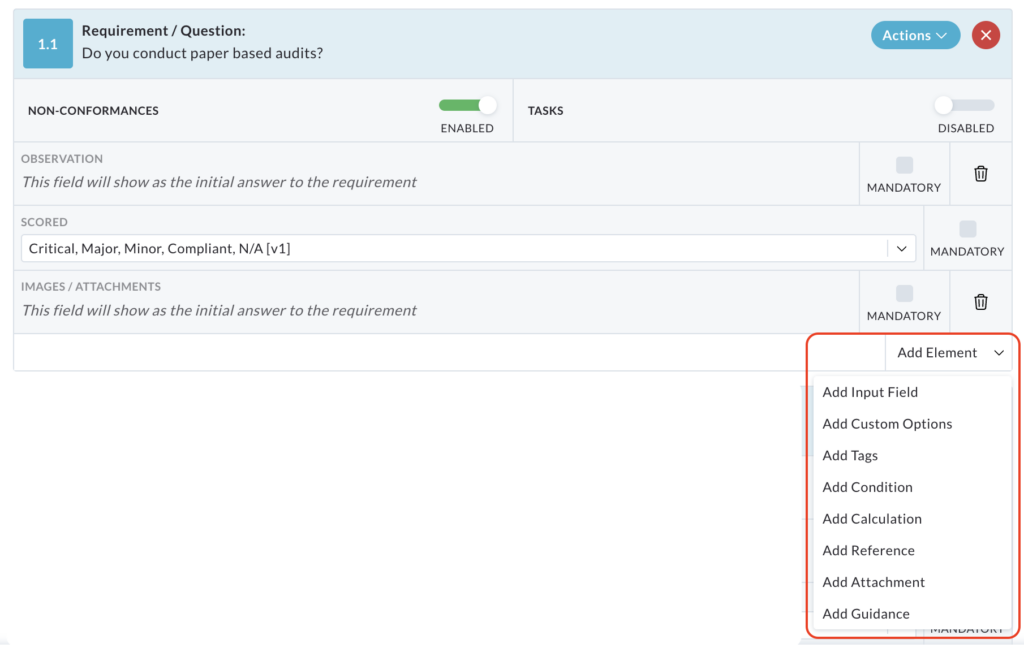
Add Input Field
This element allows you to add supplementary data collection points within a requirement, essentially acting as extra non-conformance checks.
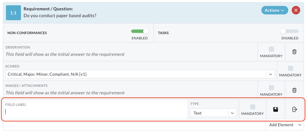
Here is a breakdown of the input field types and options:
Text: Requires a written response.
Number: Requires a numerical response, with the following validation points:
- Lower Than: Flags responses below a certain number.
- Greater Than: Flags responses above a specified number.
- Between (Inc): Flags responses outside of a specified range (e.g. a temperature range).

Date: Requires a date selection using a pop up calendar within the requirement.
Signature: Requires a signature from the individual completing the requirement.
Note: This is a new signature, not the one stored in the users profile.
Checking the Mandatory box requires the completion of the input field. This floppy disk icon saves the input field, while the arrow/door icon cancels.

The bin icon deletes the input field after it has been saved and the pencil icon will allow you to edit the element.

Add Custom Options
The Add Custom Options element allows you to define a set of specific, pre-defined responses for a requirement.
When you select the Add Custom Option element, a text box labelled Custom Option appears.
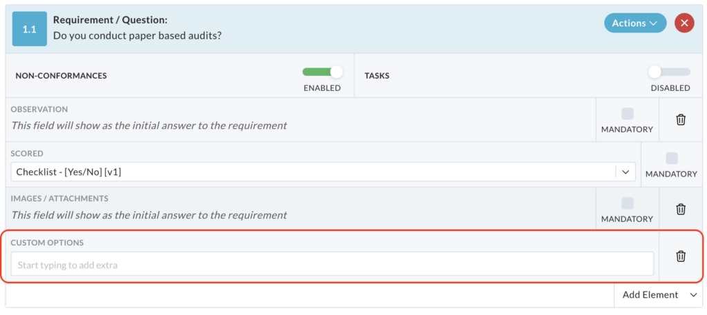
In this text box, you enter your custom response options one at a time. For example, for the question ‘What is the most common colour of pen used?’, you could enter ‘Blue’, ‘Black’, ‘Red’ and ‘Green’.
After typing each option, press the enter key. This converts the option into a pill (a small, visually distinct element) that will be displayed as a selectable choice within the text box.

The options will be displayed in a dropdown menu within the requirement when being completed.
To remove options within the text box, click with X within the pill. To remove the element, click the bin icon at the end of the row.
This feature is useful for providing a limited set of choices, ensuring consistency and simplifying data entry.
Add Tags
The Add Tags element enhances the searchability of your requirements within the template builder.
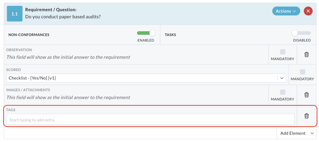
When you add the Add Tags element to a requirement, you can enter keywords or phrases that summarise the requirements contents.
For instance, if a requirement asks ‘Do you conduct paper audits?’, you could add the tag ‘Paper’.
Press enter after each word/tag is entered. This will place the word in a pill within the text box.

These tags are not visible when completing the audit, rather it works behind the scenes to refine your information.
To remove an individual tag, click the X beside the word in the text box. To remove the element, click the bin icon at the end of the row.
To find requirements related to a specific topic, use the Search Requirements… text box at the top of the templates page. Enter the relevant tag (e.g. paper) into the search box and press enter. The system will then display all requirements that have been tagged with the entered keyword.
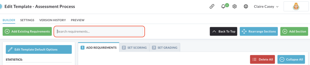
This allows you to quickly locate and manage specific requirements within your template.
Add Reference
The Add Reference element provides a way to link requirements to external documentation or internal identification systems.
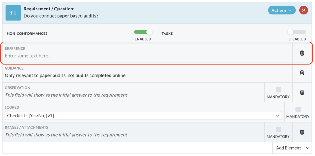
The primary purpose of this element is to establish a connection between a specific requirement and a corresponding document, such as company policy, standard operating procedure or regulatory guideline.
It can also be used to match the requirements to specific ID’s within your company documentation. This aids in traceability and verification.
The reference element can be removed by clicking the bin icon at the end of its row.

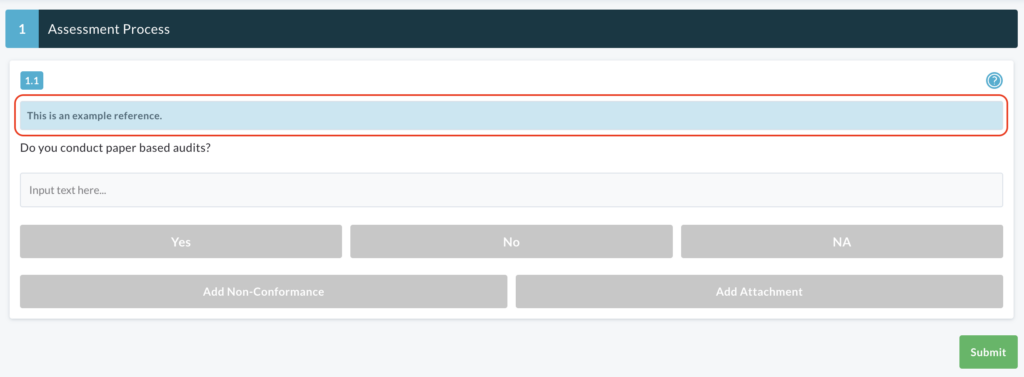
When the requirement is being used (i.e. during an audit or assessment), the reference element will be displayed in a blue box at the top of the requirement for easy access.
Add Attachment
The Add Attachment element allows you to provide users with reference images or files to aid them in completing a requirement.
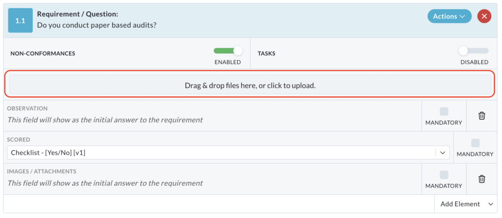
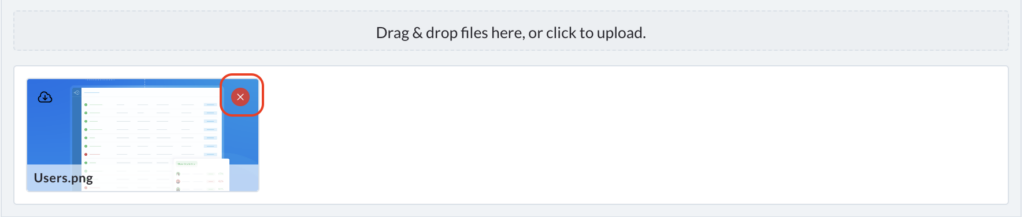
To add an attachment, click Drag and drop files here, or click to upload button.
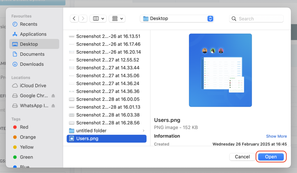
This will open your file explorer.
Select the desired file or image and click Open.
The attached file or image will then be displayed within the template.
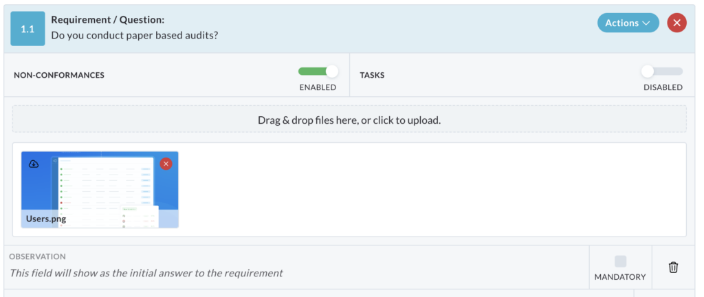
Repeat these steps to add multiple attachments.
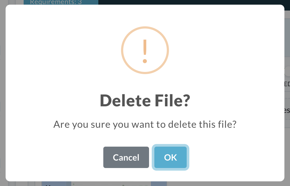
To remove an attachment, click the red X icon located on the image you wish to remove.
A confirmation popup will appear.
Click Ok to confirm deletion.
Add Guidance
The Add Guidance element is designed to provide users with on-demand help or clarification within a requirement.
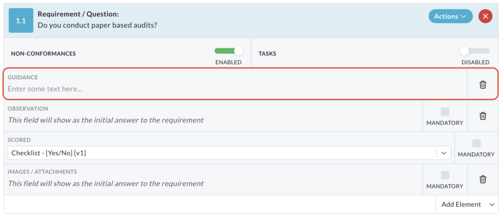
Enter the additional information or guidance into the text box within the template builder.
When added, this element inserts a question mark (?) icon into the requirement.
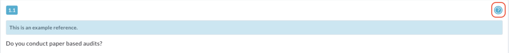
Clicking on the ? icon triggers a pop-up box that displays the additional guidance text or instructions.
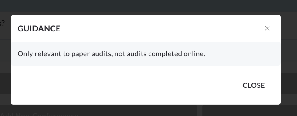
The Add Guidance element can be removed by clicking the bin icon at the end of its row.
